
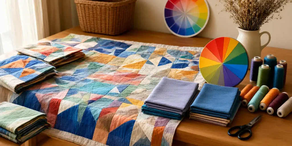
Colour Theory for Quilters: How We Choose Fabrics That Sing
We still remember the first time we walked into a packed Canadian quilt shop — bolts stacked floor to ceiling, fat quarters spilling out of baskets, and a wall of solids that looked like a paint store exploded. We had a pattern in hand, a rough idea of what we wanted, and absolutely no clue how to pull it together. Every fabric was beautiful on its own, but nothing seemed to work as a team. That afternoon changed how we approach quilting forever, because a patient shop owner sat us down with a colour wheel and showed us why some quilts sing and others just hum along. Understanding colour theory is the difference between buying pretty fabric and building a quilt that feels intentional from the first stitch to the last pass of free-motion quilting.
Why Colour Theory Matters in Quilting
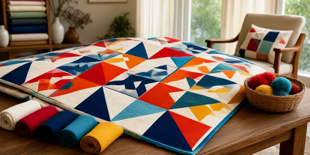
Colour is doing more work in a quilt than most of us give it credit for. It creates contrast that makes a pattern readable, it sets the mood before anyone reads a single block name, and it guides the eye across the surface. In free-motion quilting, colour decides whether your quilting lines recede into the background or pop forward as a design feature. Get it right and the quilting looks effortless; get it wrong and even flawless stitches disappear into mush.
Canadian quilters deal with an extra variable: light. Our natural light shifts dramatically from season to season, and it changes how fabric reads. A palette that looks vibrant in July sunshine can feel flat and grey in a January basement sewing room. We’ve learned to check our fabric pulls under the same lighting we’ll actually sew in, and to test them again near a window on an overcast day.
The Emotional Impact of Colour
Colour is emotional before it’s technical. Warm reds and oranges feel energetic and cozy, which is why they show up constantly in autumn quilts and holiday projects. Cool blues, greens, and purples read as calm and restful, making them a natural fit for bedroom quilts or baby gifts. When we choose a palette, we’re really choosing a feeling first and a scheme second.
Colour and Quilt Structure
Structure is where colour theory earns its keep. Contrast defines your block shapes, your sashing, and your borders. If two adjacent fabrics share the same value — the same lightness or darkness — the seam between them vanishes and your carefully pieced pattern turns into a blur. This is why so many experienced quilters plan value before they plan hue.
The Colour Wheel: A Quilter’s Best Friend
The colour wheel isn’t a rulebook, it’s a map. It shows us how colours relate to each other so we can make deliberate choices instead of guessing in the aisle. Brands like Kona Cotton and Northcott Fabrics make this easier than ever, because their solids ranges are deep enough that you can find almost any hue you’re imagining — and they’re widely stocked in Canadian shops.
Primary, Secondary, and Tertiary Colours
The basics break down like this:
- Primary colours: red, yellow, and blue — the building blocks that can’t be mixed from other colours.
- Secondary colours: orange, green, and violet — each made by mixing two primaries.
- Tertiary colours: everything in between, like blue-green or red-violet, made by mixing a primary with a neighbouring secondary.
Knowing where a fabric sits on the wheel tells you instantly whether it will harmonize with or contrast against what’s already on your cutting table.
Warm vs. Cool Colours
Warm colours — reds, oranges, yellows — advance toward the viewer and add energy. Cool colours — blues, greens, violets — recede and create calm. Mixing the two in one quilt is completely valid, but it helps to decide which family leads. A quilt with a warm focal block surrounded by cool background fabrics will pull the eye exactly where you want it.
Classic Colour Schemes for Quilt Patterns
Once you know the wheel, the classic schemes become practical tools rather than art-class theory. Each one produces a distinctly different quilt, and each one changes how you should approach your free-motion quilting thread.
Complementary and Split-Complementary
Complementary schemes use colours opposite each other on the wheel — blue and orange, red and green, yellow and violet. They deliver maximum contrast and drama. Split-complementary takes one colour and pairs it with the two neighbours of its opposite, which softens the tension while keeping the energy. For thread choice, free-motion quilting thread colour should complement or contrast with fabric based on the desired effect: match the thread to blend your quilting into the background, or choose a complementary hue to make every stitch a design element.
Analogous and Monochromatic
Analogous schemes sit next to each other on the wheel — think blue, blue-green, and green. They feel cohesive and soothing, and they’re forgiving for beginners. Monochromatic schemes use one hue in multiple values and saturations, which is where scrap quilts and modern minimalist patterns really shine. Both schemes benefit from strong value contrast, or the whole quilt can read as a single flat wash of colour.
Value and Saturation: The Secret Weapons
If we could teach only one thing to new quilters, it would be value. Canadian quilter Cheryl Arkison is known for her work on value and colour in quilting, and her writing makes the case better than we ever could: value — not hue — is what makes a quilt design visible. Saturation, the intensity or purity of a colour, is the second lever. A fully saturated red screams; the same red muted with grey whispers.
Using Value to Create Depth
Value creates depth, dimension, and the illusion of light. Place your lightest fabrics where you want highlights and your darkest where you want shadows. A quick trick: photograph your fabric pull and convert it to greyscale. If the blocks still read clearly in black and white, your value plan is solid.
Playing with Saturation
Saturation controls mood within a single hue. A quilt made entirely of low-saturation, dusty tones feels vintage and quiet. Add one highly saturated accent fabric and the whole piece wakes up. We often build a low-saturation palette and then introduce a single saturated fabric as the focal point.
Applying Colour Theory to Canadian Quilting
Canadian seasons and landscapes often inspire colour palettes for quilts, and honestly, we have an unfair advantage. Where else do you get maple reds, prairie golds, coastal fog greys, and northern lights greens in the same country?
Seasonal Palettes for Canadian Quilters
Winter palettes pull from snow shadows and evergreens — cool blues, silvery greys, deep spruce greens. Spring leans into soft greens, tulip pinks, and the pale yellow of early buds. Summer brings lake blues, sun-bleached neutrals, and garden brights. Autumn is the showstopper: rust, mustard, burnt orange, and deep burgundy. Building a quilt around a season gives you an instant, cohesive story.
Shopping for Fabric in Canada
We’re lucky to have strong brick-and-mortar options. The Workroom in Toronto is a go-to for thoughtfully curated modern fabrics, and Fabricana in British Columbia has been a staple for quilters on the west coast for decades. Both are worth a visit if you’re nearby, and both carry the kind of solids ranges that make colour planning genuinely fun.
Practical Tips for Choosing Fabric Colours
Theory is useful, but practice is what builds the skill. Here’s what actually works at the cutting table.
Tools and Apps for Colour Selection
Colour tools take the guesswork out of planning. We regularly use a physical colour wheel, a phone app that pulls palettes from photographs, and a simple greyscale filter to check value. If you’re inspired by a landscape photo, pull five colours from it and build your quilt from that palette.
Testing Colours Before You Cut
Never commit to a full cut without a test. Lay your fabrics out together, step back, and squint. Take a photo and check it in greyscale. Shop your stash first — you’d be surprised how often the missing colour is already in a bin. And practice your free-motion quilting on colour swatches before quilting the real thing, so you can see exactly how a thread colour behaves against each fabric.
FAQ
What is the fastest way to check if my quilt fabrics work together?
Photograph your fabric pull and convert it to greyscale. If the shapes and contrast still read clearly, your value plan is working. If everything blends into one grey mass, you need more light-versus-dark variation.
Should free-motion quilting thread match the fabric or contrast with it?
It depends on the effect you want. Matching thread blends the quilting into the fabric so texture leads. Contrasting thread makes the quilting itself a visible design element. Free-motion quilting thread colour should complement or contrast with fabric based on that desired effect.
Which solid fabric brands do Canadian quilters rely on most?
Kona Cotton and Northcott Fabrics are two of the most popular choices among Canadian quilters, thanks to their extensive colour ranges and consistent quality. Both are widely available through Canadian shops.
Where can I shop for fabric in Canada?
The Workroom in Toronto and Fabricana in British Columbia are two well-known Canadian fabric shops. Many quilters also order online from Canadian retailers to avoid cross-border shipping and duties.
Do I need to follow colour theory rules exactly?
No. Colour theory is a set of tools, not laws. It helps you predict how fabrics will interact, but some of the most striking quilts break the rules deliberately. Learn the framework first, then bend it.
Colour theory isn’t something you master in one shopping trip — it’s a skill built over years of pulling fabrics, making mistakes, and noticing what works. Start with value, experiment with saturation, and let Canadian seasons inspire your palettes. Pull something bold off the shelf, quilt it with thread that makes you a little nervous, and see what happens. That’s how every quilter we admire got good.